I was introduced to the wonderful world of DnD by my friends and I fell in love with it so much that I wanted to make a web app for it. My friend is a wonderful Java developer, and she is helping with all the database elements while I work on the front end and learn Angluar.
Research
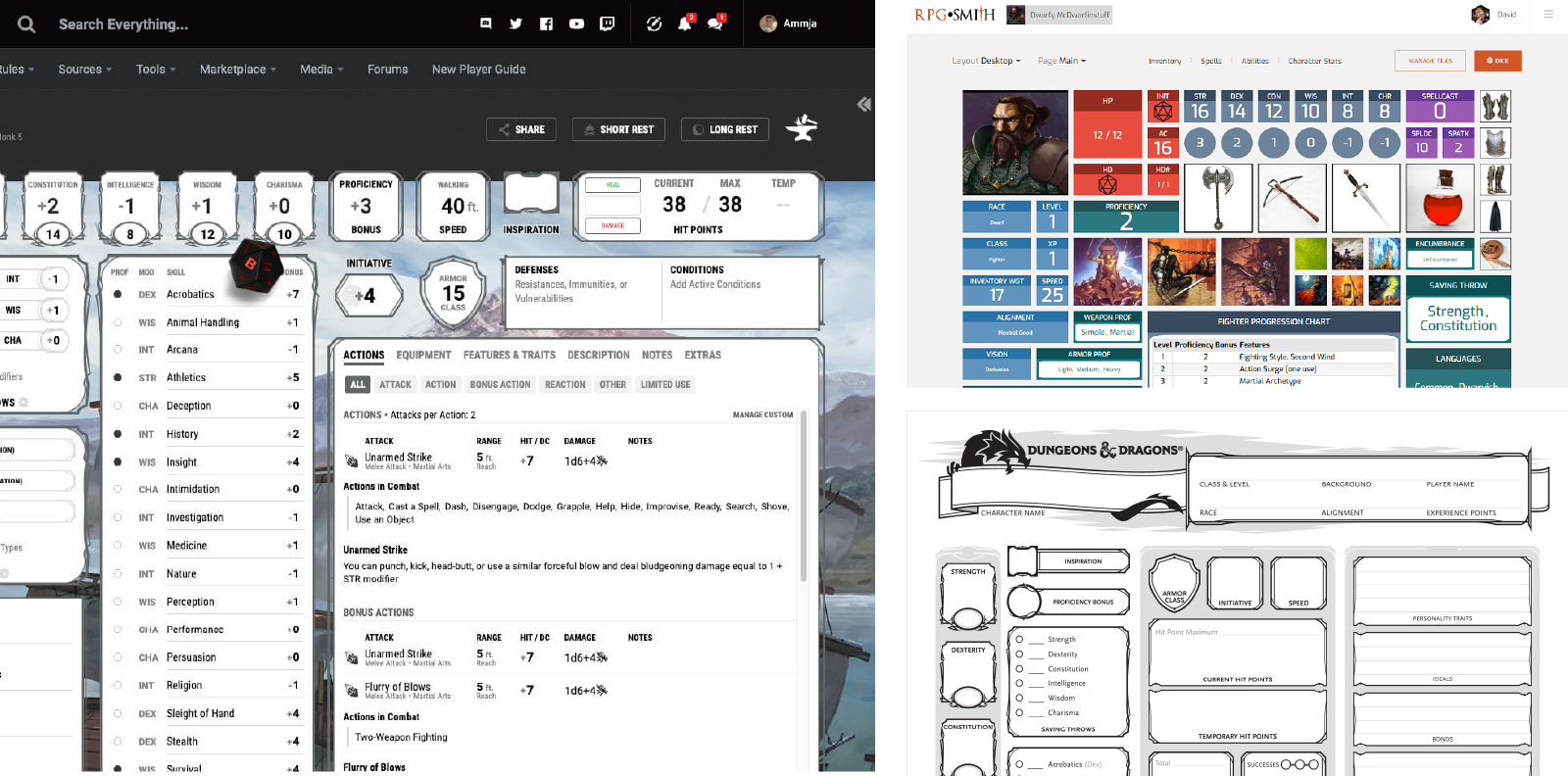
I did a little bit of research on existing DnD dashboards out there to get a feel for what kind of elements I would need to include on the pages. In addition, I also did some research for the style that I wanted to use for the dashboard.
I took a lot of inspiration from existing DnD printable character sheets, which typically have all the information a player could want listed on one page. The official DnD site also has a similar dashboard tool that essentially takes what is on the sheet and translates it to a web page. While I really enjoyed the designs, I wanted to try and make my design a bit more streamlined and SASS-y looking (see what I did there? Sassy? I’ll be here all week).
Wireframes
As I mentioned before, I wanted to start my layout with a SASS application in mind, so I created a very rough layout that had all the elements I wanted to show the user. I even had a checklist of all the stat items a user might need that I crossed off as I added them to my wireframe, to be sure I didn’t miss any.
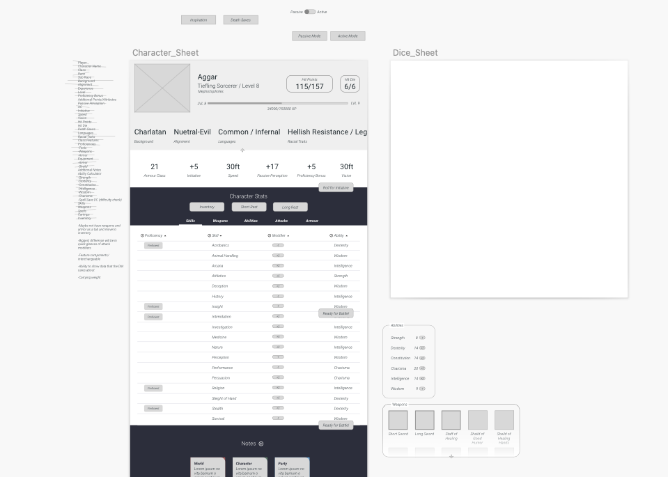
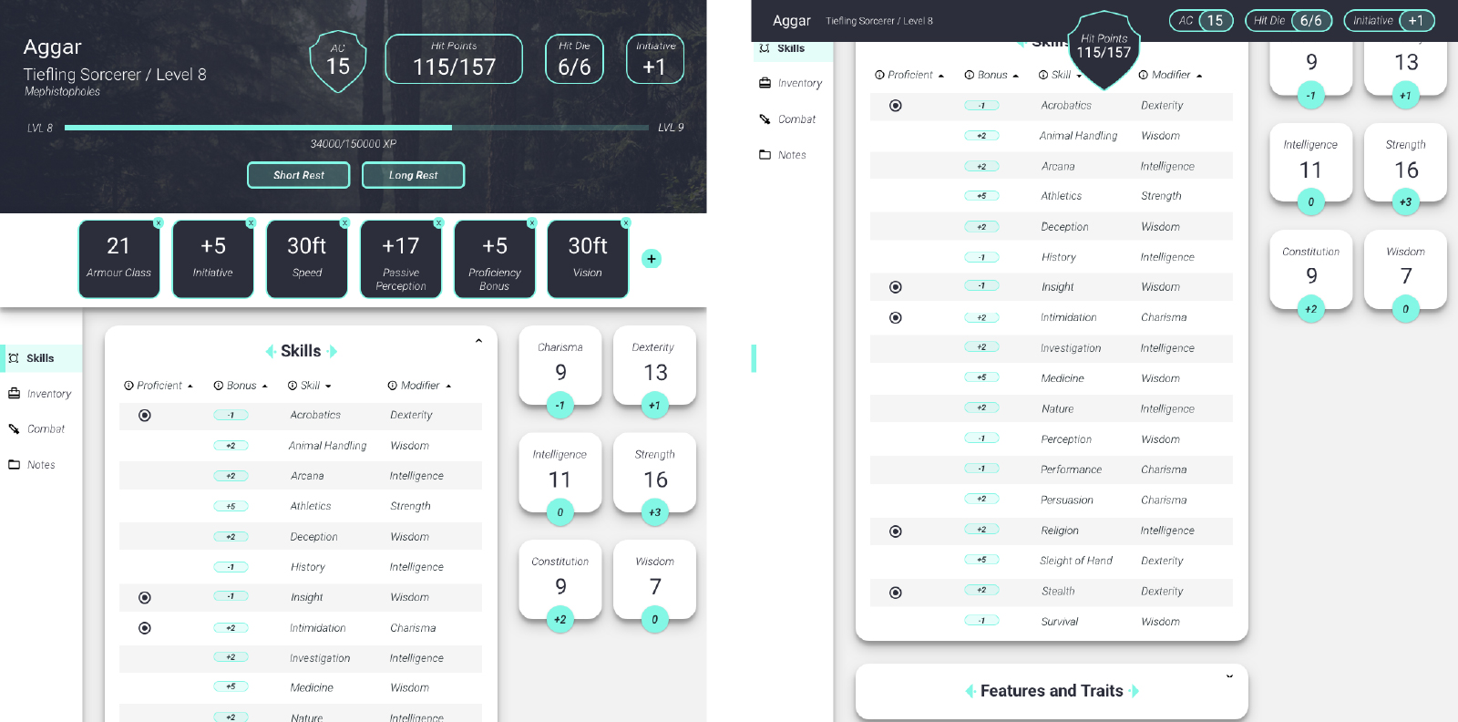
My first wireframe out of the way, I then took it to the next step and tried out a more structured page, with more clear indications of what design elements would look like. I took it back to my DnD group and asking for feedback. One of the immediate things they commented on was the circle health bar, which didn’t make any sense in context. Yea, it looked cool, but it wasn’t an accurate way to tell how much health a player had left. They noted that a written number of exactly how much health a player had left would be much more useful, since a lot of hits and rolls in DnD rely on numbers and multiplications of those numbers, rather than a health bar.
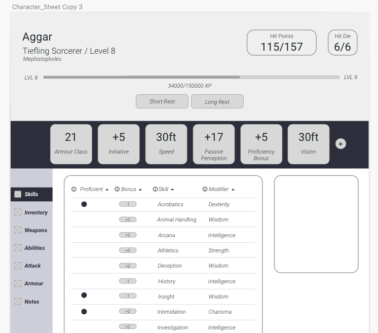
By removing the big circle from my second wireframe, it freed up space to have more information about the actual character, as well as room for other information like Hit Die to appear on the screen.
UI High Fidelity
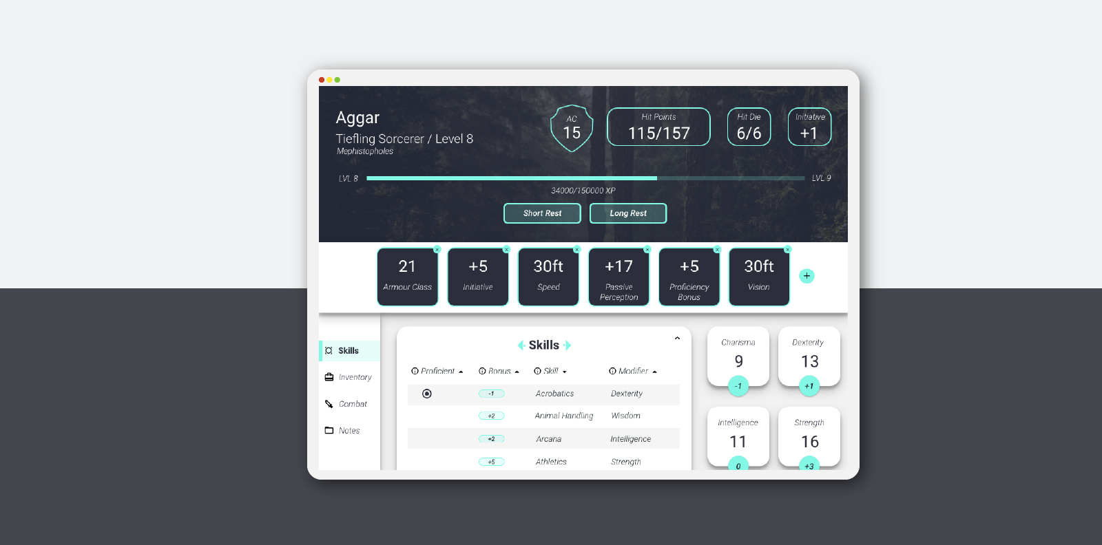
In order to begin working on the Angular portion of the design, I started to create a high-fidelity version of my initial play screen. I really wanted a Material-esque design feel to my components, so it centered around a lot of rounded corners and drop shadows. I also wanted players to be able to customize their banner, so I added an image up top that could be changed out. I also wanted a little “zing” of accent color, so I chose #83F7E5 as both a very engaging, high profile color, and as an accessible contrast color to the dark #2C2E3B text color.
After Thoughts
This design is still a work in progress, and I pick it up every now and then with my friend when we feel like working on it. The next portion I would like to work on is the inventory section of the design, since that could present an interesting challenge for how to display it (Notes? Small icons? Illustrations?). Now that COVID is (hopefully) past us, I would like to get a new campaign together and use this tool for it so that I can get even more user feedback. If you would like to see what we have built so far, head on over to Github to check it out!